
In this guide, you will be guided through a number of best practices in terms of making your Word documents accessible to most people – including people with a wide range of disabilities.
Note: This guide applies to Office 365 for Windows and Mac.
The guide will cover the following topics:
Built-in Headings and Styles
Headings provide an easy way of getting an overview of the contents in your document, both visually and for users of assistive technology. Be sure not just to apply bold or manually change the text size of the heading in question, as this will not make it navigable by assistive technology. Instead, use the built-in heading tool.
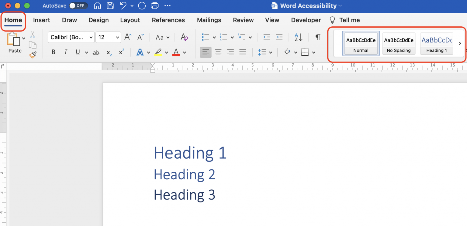
Using the built-in headings and styles in Word automatically provides assistive technology, such as screen readers, the ability to quickly navigate through a document’s main sections and get the gist of what the document is about. Furthermore, make sure to make your headings as descriptive as possible, so the reader gets a clear sense of the section’s contents and purpose. It is very important that you do not skip heading levels and keep them strictly hierarchical. Thus, if you use heading level 1 as the document’s title, use heading level 2 for sections, 3 for subsections, and so on.
- To apply heading styles, you can locate the Style you would like to use on the Home tab or use the keyboard shortcuts. By default, the first three heading levels have keyboard shortcuts (Command+Option+1 through 3 on Mac and Ctrl+Alt+1 through 3 on Windows), but you can customise this and add more keyboard shortcuts for the styles you use frequently.
It is possible to change the formatting such as text size and text colour of the different styles of headings if these do not fit with the aesthetics of your document.
Another non-accessibility related upside to using the built-in styles is that Word will be able to automatically generate a table of contents for you when you are done writing your document.
Accessible Tables
Tables organise information visually and show you the relation between different properties. Be sure to only use tables for data, and not for strictly visual layout purposes.
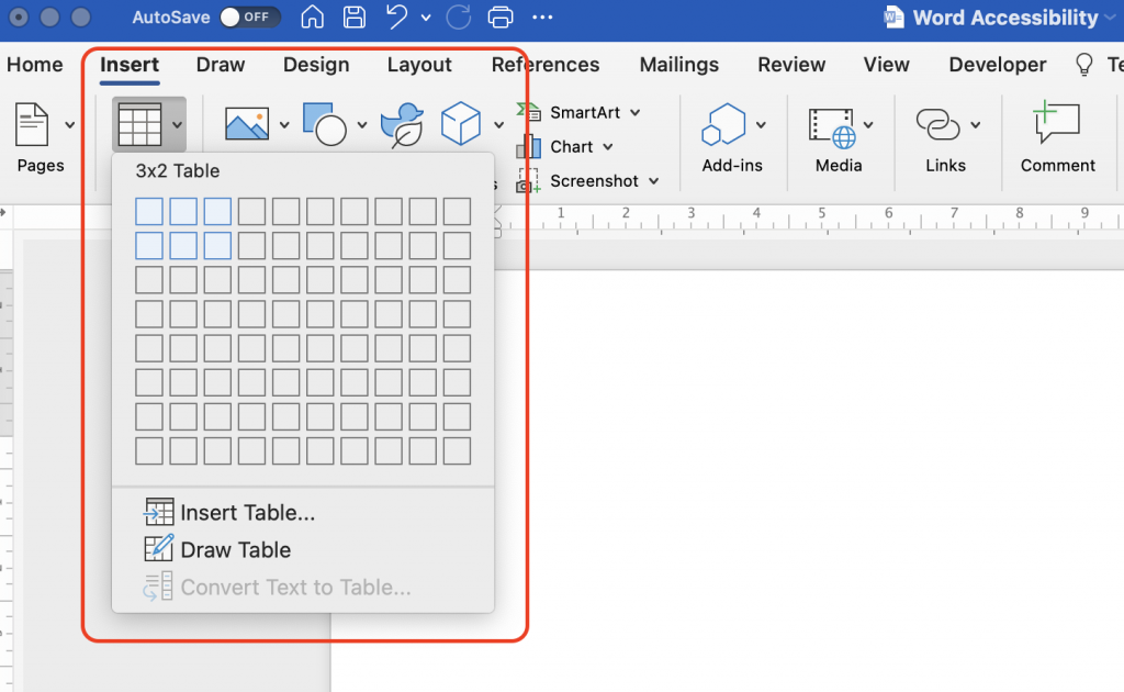
- From the Insert tab in the top ribbon, click on Table and choose how many rows and columns you need.
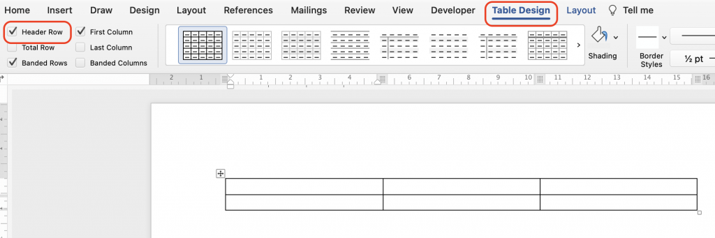
- Once the table is created, make sure that the checkbox Header Row is checked in the Table Design tab. To add column headings to the table, place your cursor in the first cell of the top row in your table, and type your header of choice. Then press the tab key to fill out subsequent column headers as needed.
- It is possible for you to change the design of the table, so it aligns better with the overall visual presentation.
- Keep in mind that the colours chosen for the table should have sufficient contrast. Likewise, you should not convey meaning through colour alone as users with colour blindness will not be able to understand that meaning.
Alternate Text and Closed Captioning
For all non-text elements in your presentation, there should be a text alternative, also known as ‘alt text’. The alt text allows users who use text-to-speech assistive technology, such as screen readers, to understand the purpose of the non-text element. These elements can be graphics, images, charts, SmartArt, icons, logos, etc.
Without these alt texts, the blind or visually impaired users may not gain access to the information of the non-text element. The descriptions should be short and communicate the main purpose of the element.
You should avoid using text embedded within a picture as the sole method to convey important information – instead, include the text directly in the document, as this will make it easier for people with a wide range of disabilities, such as blindness and dyslexia, to work with the text in question.
If you must include a picture with embedded text, be sure to repeat the text directly within the document.
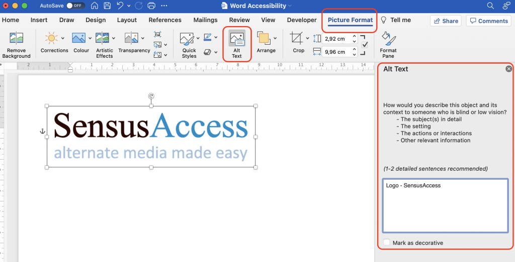
- Click on the element you want to describe with an alt text.
- Click on the tap Picture Format in the top ribbon, and then the button Alt Text. You can also right-click while focused on the content in question and select “Edit Alt Text”.
- A panel appears, and you can add the alt text.
- If the graphic is purely decorative, you should instead mark it as decorative in the panel, and screen readers will then ignore the element.
Tip: If you are a screen reader user and you are interacting with a document with no alt text, you can enable Word’s “Automatic Alt Text” feature. This is not a substitute for an accessible document but may give you a hint of what the picture is about. To enable automatic alt text, select Options (Preferences on a Mac-computer) under the File tab (Word tab on a Mac-computer). Then, under Ease of Access, in the Automatic Alt Text section, select the “automatically generate alt text for me” option.
If you have audio or video content embedded within your document, it is important to add closed captioning to this as well. This will make people who are deaf or hard of hearing able to follow the dialog and understand significant audible cues. Closed captions contain, beside a transcription, descriptions of audio effects such as music or other significant sound effects.
Accessible Link Texts
Screen reader users sometimes scan through a document by browsing a list of links. Thus, the purpose of the link, or where it is pointing, should always be apparent from the link text itself – you should avoid using ambiguous link texts such as “Click Here”.
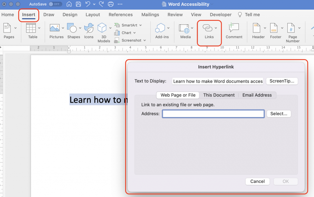
- To add accessible text to a link in Word, highlight the descriptive text, you want to be the link text.
- In the Insert tab, click on Link.
- In the pop-up window, you can insert the URL that the text should link to.
- It is also possible to do it the other way around, and insert the URL to the document, right click on the link and from the context menu choose Link (Edit Hyperlink on a Windows-computer) and fill your link text in the “text to display” field, then click ok.
Handling Math
If you need to input and read math accessibly, you have a couple of options depending on your specific needs. If you run a version of NVDA or Jaws that supports UI-automation in Office, you can use Word’s built-in equation editor. To make sure NVDA is using UI -automation, access the NVDA Settings and go to the Advanced section, then set the “use UI automation to access Microsoft Word document controls” combo box to “always”. You can press alt+= or click insert>equation to bring it up and access the subsequent options from the equation ribbon that appears.
It also supports LaTeX input if you are used to typing expressions in that language. If you need to export your equations as MathML or the recipient of your document is a user of a legacy screen reader, you can use the MathType plugin by Wiris to insert and export your equations.
Using the MathType editor is beyond the scope of this guide, but The DAISY Consortium has written a guide on using MathType to export accessible math.
Accessible Fonts and Multiple Ways of Discerning Importance
Using a font that is clearly legible, benefits people with a number of disabilities including colour blindness, visual impairments, ADD, etc. To reduce the reading load, use sans serif fonts such as Calibri or Arial.
Ideally, your document should also be readable in high contrast mode. For example, you can use bright colours or high contrast colour schemes on opposite ends of the colour spectrum. This will make it easier for people who are colour blind to distinguish text.
If you convey meaning by a visual attribute such as colours, underlining, or italics, make sure to add an alternative way of understanding this, as a user with colour blindness or visual impairment might not perceive the visual cues.
On Headers and Footers
Page headers and footers are accessible but are not automatically read by screen readers. Thus, if the information you wish to convey is important, you will need to include it within the main body text of the document. This is not to say that you should avoid using headers or footers to convey information such as page numbers, but simply be aware that a screen reader might not read them automatically or consistently. If you include footnotes or endnotes, these will be picked up and are readable by a screen reader, however.
You should also note that if you convert to DAISY, page numbers will be identified based on the MS Word pagination. To obtain custom pagination, use the PageNumber style from the Save As DAISY plug-in for Microsoft Office (opens in new tab) for your custom page numbers.
Metadata
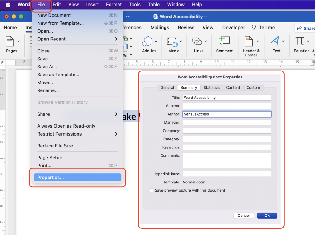
Make sure to add or change relevant metadata, such as the document author, to your Word document. This will make it easier for apps and devices to programmatically determine the document properties and index it accordingly.
- In the File tab, select Properties (Info on a Windows-computer).
- By default, the author will be set to the username in which Microsoft Word is installed. You can change this as well as the title of the document.
When Exporting Your Document to PDF
If you need to export your document to PDF, be sure to select the “options” button and check the “Document structure tags for accessibility” checkbox to ensure that the exported PDF is as accessible as possible.
Accessibility Checker
Word comes with a built-in accessibility checker. This accessibility checker can help you identify any potential accessibility problems with your presentation – including many of the issues listed in this guide.
Although an automated accessibility checker is a great tool, do not skip on the manual check as well. An automated tool cannot detect all accessibility issues, and the build-in accessibility checker does not adhere to the WCAG 2.1 standards.
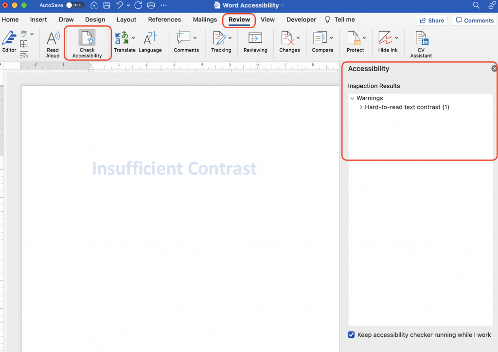
- In the Review tab, click Accessibility Checker.
- If the accessibility checker finds any issues, it will show them in a list in the right pane.
- At the bottom of the accessibility pane, the checker also provides information about how to fix the issue.
Things to Be Aware of or Avoid
In order to make your document as accessible as possible, you should be aware of or avoid the following document features in general:
- Avoid Word art as it is not accessible to assistive technologies.
- Avoid drop caps, as it is not accessible to assistive technologies.
- Avoid pictures of text – instead, include the text within the body of your document.