
PowerPoint AccessibilityPowerPoint AccessibilityIn this guide, SensusAccess will introduce you to steps you can take to make your PowerPoint presentations accessible to most people – including people with a wide range of disabilities. Creating accessible presentations in PowerPoint is really a matter of adapting how you already work, rather than learning something completely new.
The guide will cover the following topics:
- Templates
- Slide Layout
- Slide Design
- Slide Content
- Alternative Text
- Accessible Link Text
- Accessibility Checker
- Conversion to Other Formats
Note: The following guide has been prepared using the PowerPoint version available in Office 365 on a Mac-computer (macOS).
Templates
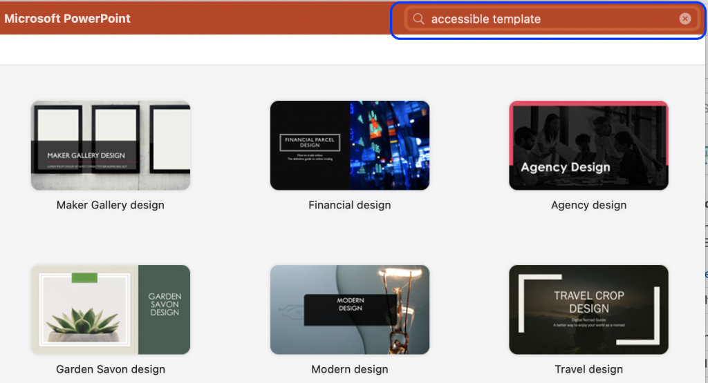
Firstly, make the work a bit easier by choosing a pre-designed template. Microsoft has a collection of their most popular accessible templates, or you can search for a template in PowerPoint by using the search field in the top right corner when opening the application.
You should not assume that the pre-designed templates found in PowerPoint are already completely accessible, but they have built-in features that can help to ensure that your presentations are more accessible.
Slide Layout
Whether you are working in a pre-designed template or have started your presentation from scratch, PowerPoint provides you with different choices of slide layouts when you need to add new slides to the presentation.
- In order to add a pre-set slide, click on the arrow by the button New Slide from the Home tab or the Insert tab in the top ribbon.
- Pick the appropriate slide layout.
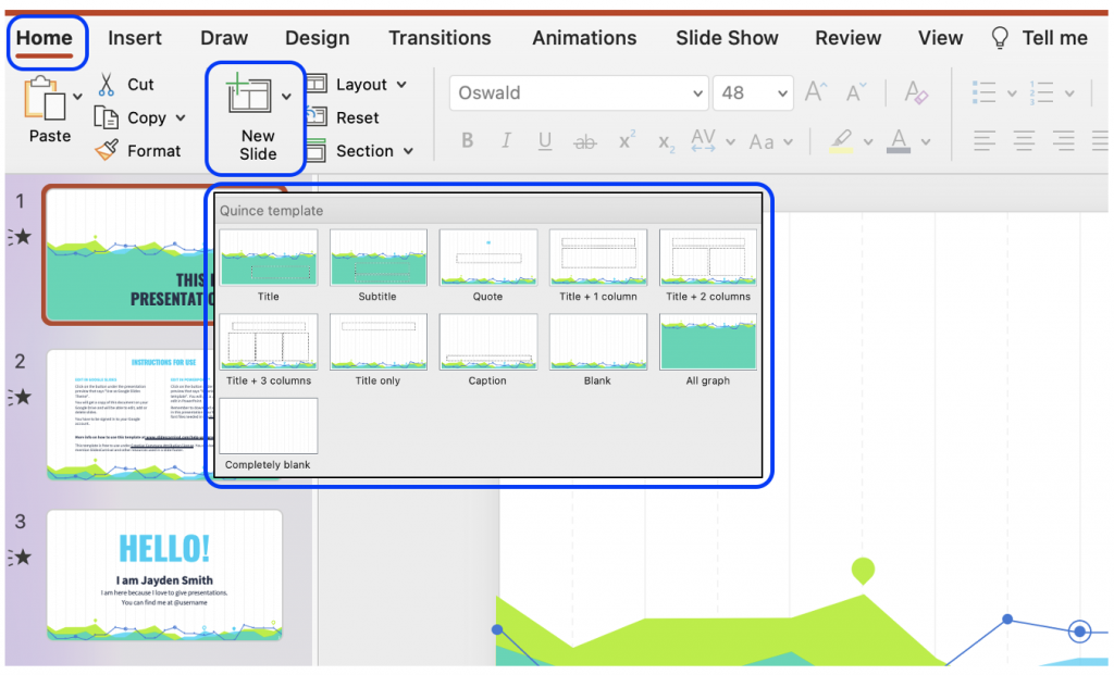
The dotted boxes on the slide layout are Placeholder Boxes. In these you can add titles, text, images, graphs, etc.
Reading Order
Users without a visual impairment usually read and view a PowerPoint slide in the order the elements appear in the slide. By default, screen reader software used by individuals with a visual impairment will first read the title of the slide, and then the software will read the elements in the order in which they were added to the slide.
The order the elements appear in and the order in which they were added may not match. To ensure the screen reader software reads the elements in the order it was intended, you should check and set the reading order.
The advantage of choosing a pre-set slide is that the reading order is already coherent with the order in which the elements are presented. Usually, at least. However, often you add new elements to the slide, or you rearrange the elements, in which cases you should make sure the reading order makes sense.
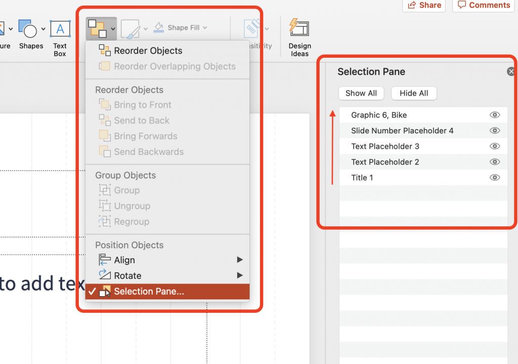
- On the Home tab, select Arrange, and click on Selection Pane.
- The Selection Pane will appear on the right side of you screen, and it will show you the order in which the elements were added. That means you should read the order from the bottom to the top in the panel.
- You can rearrange the reading order by simply clicking and dragging elements up and down. Note: In the Windows version of PowerPoint, you can also use the arrows in the pane to rearrange the order.
- To the right of each element is an icon that looks like an eye. If you click on this icon, the element will visually be hidden from the slide, but it will still be read by screen reader software.
Slide Design
If you have chosen a pre-designed template, this comes with design elements that work together such as colours, fonts, and backgrounds. However, if you choose to make edits to these elements, you should choose accessible fonts and colours.
Fonts
When it comes to text, make sure your audience is able to read everything on your slides by opting for a large font size. Keep in mind that if you give an in-person presentation, your audience in the back should be able to read the text as well.
Colour Contrast
Being able to read the text in your presentation, requires that the contrast between the colour of the text and the colour of the background is sufficient. If you have chosen an accessible template provided by Microsoft, there is a high chance that the colours in this template will have sufficient colour contrast. However, you should always make sure; especially if you are in a position where you want to change the colours.
WCAG 2.1 Success Criterion 1.4.3 specifies a contrast ratio of 4,5:1 if the font size is less than 18pt/24px (or bold and less than 14pt/18½px). Font size bigger than this requires a contrast ratio of 3:1. There are many free colour contrast checkers available online.
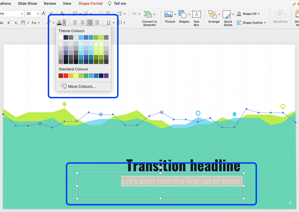
- To change the colour, simply highlight the problematic text.
- From the Home tab in the top ribbon, click on the arrow next to the Font Colour to open a selection of colours to choose from.
- Choose an appropriate colour and run a new colour contrast to make sure the contrast is now sufficient.
Slide Content
PowerPoint is a tool meant to make presentations. The application has built-in features that can make presentations more appealing, and you can present data in a way that, hopefully, captures the attention of your audience. However, some of these built-in features may not be accessible.
Slide Titles
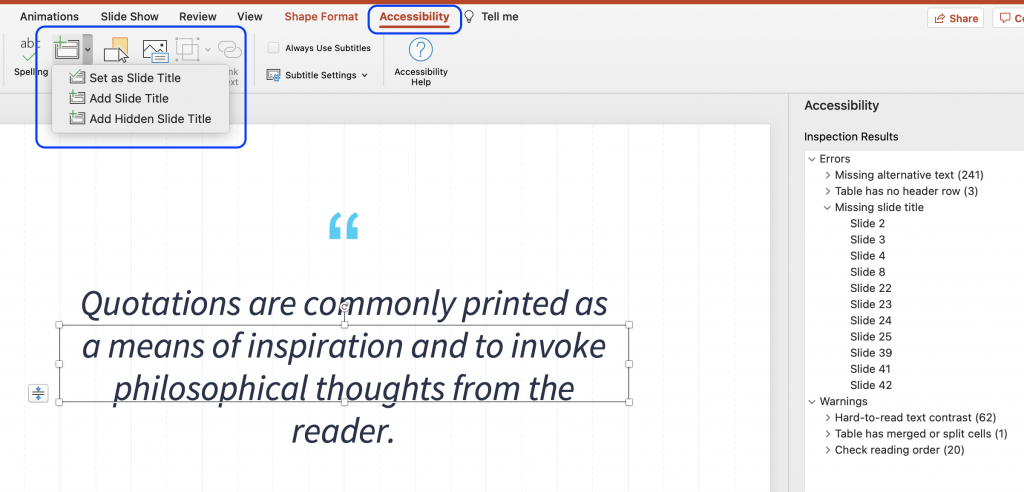
Every slide should have meaningful and unique title. When navigating through the slides, a screen reader reads the title of the slide. If a slide does not have a title, or if more slides have identical titles, it can be difficult for users of screen readers to navigate in the presentation.
Most of the slide layouts provided by PowerPoint includes a Placeholder Box for a slide title. Choose one of these layouts and add the title.
Even if you do not want a title on the slide – if the slide simply consists of a full image – you should still make the slide accessible by then adding an invisible title. This can be done by making it invisible from the reading order.
Alternatively, if you run the Accessibility Checker it will inform you of the slides that do not contain a slide title. From the Accessibility tab, you will then have the option to insert a slide title by either having the title be existing text on the slide, new text in a new Placeholder Box, or adding a hidden slide title.
Animation and Transition
In the tabs Animations and Transitions in the top ribbon, you can choose to animate different elements on a slide as well as the transitions between different slides.
Movements on the slide or in between slides can be distracting for some users. Likewise, it may cause screen readers to re-read the slide or read the elements out of order. You should therefore consider if an animation or transition is necessary for your presentation. If you choose an animation or transition, make sure it appears or advance “on click” and is not automatically timed.
Remember, if your animation conveys any form of information, that same information should be available to users with visual impairments. For example, by adding captions or alt text.
Data Tables
Using tables in your presentation can be an efficient and organized way to present data. However, if these tables are not implemented correctly, they can be an accessibility challenge for users of screen readers.
A table is implemented incorrectly if it contains split cells, merged cells, nested tables, and/or unspecified column header.
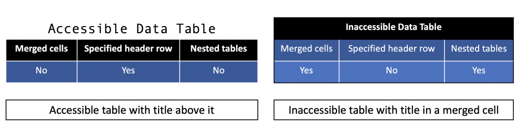
When a table is implemented correctly it is simple in its structure, the header row is specified, tables are not nested within each other, and the title is placed outside the table. Additionally, tables should be made using the correct tool in PowerPoint. Do not use the tab key to create a table, as it will only visually look like a table, but will not be accessible to users of screen readers.
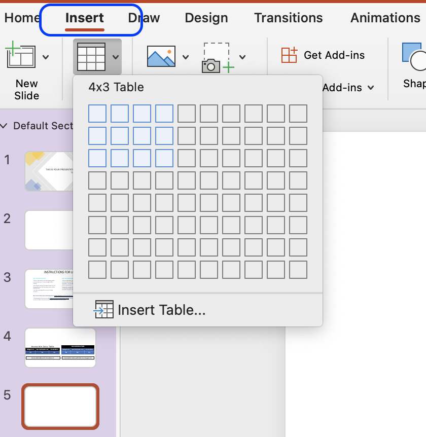
- From the Insert tab, click Table and choose how many rows and columns you need.
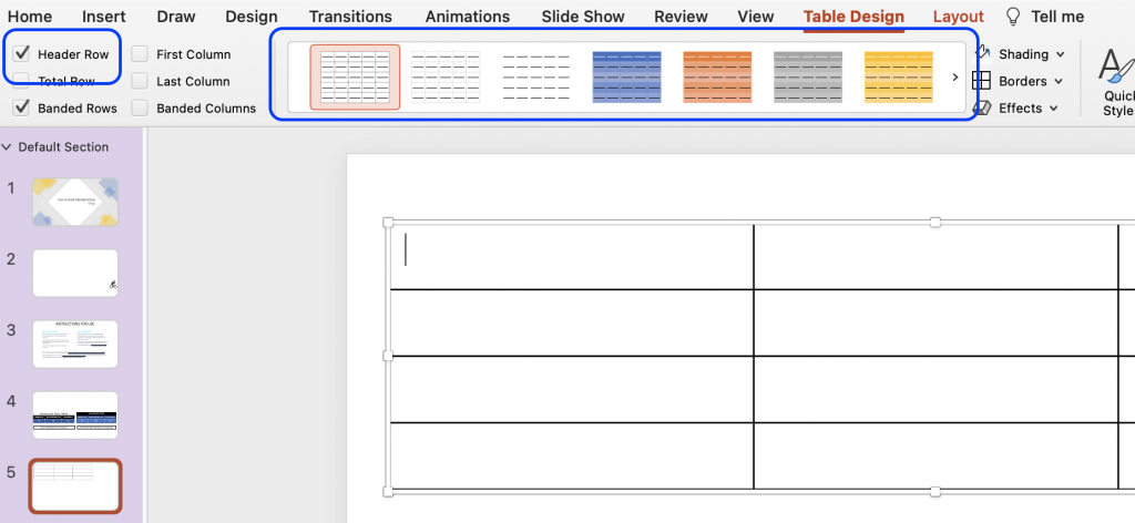
- Once the table is created, make sure that checkbox Header Row is checked in the Table Design tab.
- It is possible for you to change the design of the table, so it aligns better with the overall visual presentation.
- Keep in mind that the colours chosen for the table should have sufficient contrast. Likewise, you should not convey meaning through colour alone as users with colour blindness will not be able to understand that meaning.
Embedded Multimedia
If your presentation includes time-based media, such as a video, make sure subtitles, closed captions or video descriptions are provided.
- Subtitles contains a transcription (or a translation) of the dialogue.
- Closed captions contain, beside a transcription, descriptions of audio effects such as music or other significant sound effects.
- Video descriptions are audio-narrated descriptions of important visual elements. This type of description ensure that video content is more accessible to individuals with visual impairment.
If the video or audio is longer than 3 seconds, make sure you provide a way for the user to pause or stop the media content.
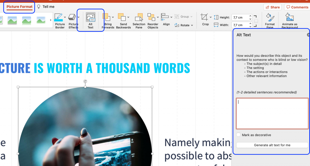
Alternative Text
For all non-text elements in your presentation, there should be a text alternative, also known as ‘alt text’. The alt text allows users who use text-to-speech assistive technology, such as screen readers, to understand the purpose of the non-text element. These elements can be graphics, images, charts, SmartArt, icons, logos, etc.
Without these alt texts, the blind or visually impaired users may not gain access to the information of the non-text element. The descriptions should be short and communicate the main purpose of the element.
- Click on the element you want to describe with an alt text.
- Click on the tap Picture Format in the top ribbon, and then the button Alt Text. A panel appears, and you can add the alt text.
- If the graphic is purely decorative, you should instead mark it as decorative in the panel, and screen readers will then ignore the element.
Go Beyond Alternative Text
Remember, alt text is only accessible to users of screen readers, and not all users with visual impairments use a screen reader. Some rely on screen magnification. Therefore, you should check that the graphical element can be enlarged by zooming in. If the element appears pixilated, you should add descriptive captions to the graphical element.
Accessible Link Text
If you plan on distributing your presentation and it contains hyperlinks to websites, other online resources, or even other slides within the presentation, make sure that the link text makes sense in its own context.
A link text makes sense in its own context if it is descriptive. Link texts such as “Read more” or “Click here” are vague and redundant. Instead, accessible hyperlinks have a descriptive text that will become the active link.
- Highlight the descriptive text, you want to be the link text.
- In the Insert tab, click on Link.
- In the pop-up window, you can insert the URL or choose a slide within the document that the text should link to.
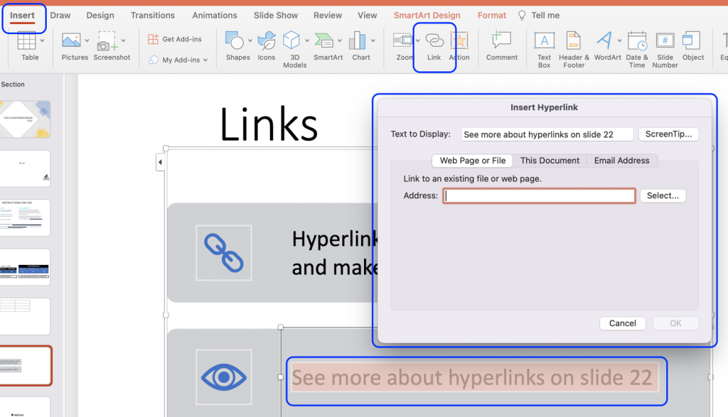
By default, the link text will now appear blue and underlined. You should ensure that the link text has sufficient contrast against the background of your slide. Remember, link text can be differentiated by colour, bold, underline, and/or italics. You cannot use colour alone to differentiate the link text from other text on the slide.
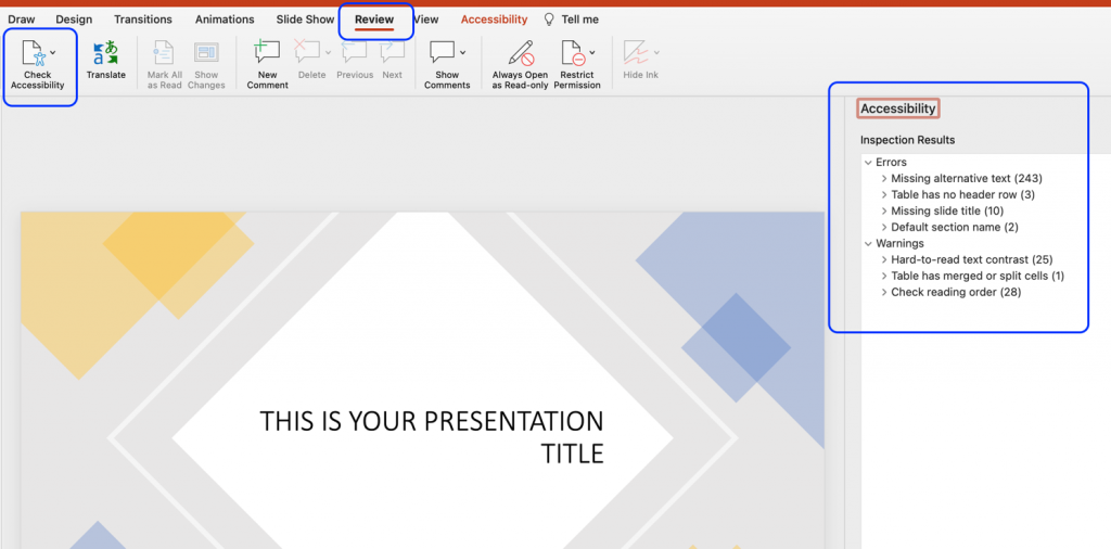
Accessibility Checker
PowerPoint comes with a built-in accessibility checker. This accessibility checker can help you identify any potential accessibility problems with your presentation – including many of the issues listed in the steps above.
Although an automated accessibility checker is a great tool, do not skip on the manual check as well. An automated tool cannot detect all accessibility issues, and the build-in accessibility checker does not adhere to the WCAG 2.1 standards.
- In the Review tab, click Accessibility Checker.
- If the accessibility checker finds any issues, it will show them in a list in the right pane.
- At the bottom of the accessibility pane, the checker also provides information about how to fix the issue.
Conversion to Other Formats
If you have followed the tips, tools, and best practised outlined above, you should have created a PowerPoint Presentation that is accessible to most people. However, PowerPoint is a software made specifically to design (visual) presentations, and it is often not the easiest format to work with for visually impaired users.
With the SensusAccess service it is possible for users to convert the PowerPoint format into something that is easier for work with. For example, a PowerPoint presentation can be converted into tagged PDF, HTML, or RTF outline. For more information on conversion possibilities with the SensusAccess service, check Module 4: Converting inaccessible and tricky documents (opens in new tab) or the SensusAccess Conversion Options.