
On this page you will find a guide on how to create/edit/delete a theme for the SensusAccess LTI. If you do not create a theme for your LMS instance, by default the tool loads the default theme.
Create a Theme
Follow the steps outlined below to create a theme.
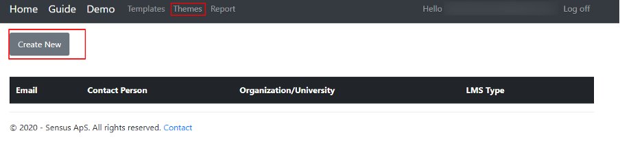
1. Click on Themes in the top navigation menu on the SensusAccess LTI portal
2. Click on the Create New button.
3. In the form, choose LMS Type, Consumer Key and customize the stylesheet as per your need.
| Class | Description |
|---|---|
| robo-nav-btn-style | Used for buttons font-size, line height, width, height |
| .btn | Used for buttons border, outline, padding and cursor style of the buttons |
| .btn-primary | Used for buttons color, background color and border color |
| btn-primary:hover | Used for buttons color, background color, border color and border when the mouse is over the buttons |
| btn-primary:not(:disabled):not(.disabled):active, .btn-primary:not(:disabled):not(.disabled).active, .show > .btn-primary.dropdown-toggle | Used for buttons color, background color, border color, border when buttons are active or clicked |
| btn-primary:focus, .btn-primary.focus | Used for buttons color, background color, border color, border etc. when focused with keyboard |
4. Click on the Create button.
5. Click on the SensusAccess LTI tool in your LMS instance and the newly created theme will be reflected.
Edit a Theme
Follow the steps outlined below to edit a theme.
1. Click on Themes in the the navigation menu in the SensusAccess LTI portal.
2. Click on the Edit button to modify the theme.
3. Make the necessary changes on the stylesheet.
4. Click on the Save button
5. Click on the SensusAccess LTI tool in your LMS instance and the newly created theme will be reflected
Delete a Theme
Follow the steps outlined below to delete a theme.
1. Click on Themes in the navigation menu in the SensusAccess LTI portal.
2. Click on the Delete button to delete the theme.
3. Click on the Delete button in the confirmation page.
4. Click on the SensusAccess LTI tool in your LMS instance and the tool will be loaded with the default theme.
How to Change the Font
To change the font in the SensusAccess LTI, you can simply add CSS while creating/editing the stylesheet.body {
font-family: “Times New Roman”, Times, serif;
}
Remaining other CSS goes here …
If you wish, you can also add other CSS attributes such as font-size, font-weight, line-height, and so on.
How to Add Google Web Fonts
It is also possible to add Google web fonts and to do so you have to import the wished google font at the beginning of the Theme and after that you can reference the font in the body{} tag. If you want to add Muli Google font in the SensusAccess LTI tool below is a sample CSS.@import url(‘https://fonts.googleapis.com/css2?family=Muli:ital,wght@1,900&display=swap’);
body {
font-family: Muli, sans-serif, “Lucida Console”, Courier, monospace !important;
}
.robo-nav-btn-style {
font-size: 20px;
line-height: 20px;
width: 100%;
height: 50px;
border-color: ActiveBorder;
}
/* Style the buttons */
.btn {
border: none;
outline: none;
padding: 10px 16px;
cursor: pointer;
}
.btn-primary {
color: #fff;
background-color: #113277;
border-color: #113277;
}
.btn-primary:hover {
color: #113277;
background-color: #fff;
border-color: #113277;
border: solid;
}
.btn-
primary:not(:disabled):not(.disabled):active, .btn-primary:not(:disabled):not(.disabled).active, .show > .btn-primary.dropdown-toggle {
color: #113277 !important;
background-color: #fff !important;
border-color: #113277 !important;
border: solid !important;
}
.btn-primary:focus, .btn-primary.focus {
color: #113277;
background-color: #fff;
border-color: #113277;
border: solid;
box-shadow: 0 0 0 0.2rem #113277 !important;
}